Top tips from our tech team for a great website
Having a website that’s easy to use is incredibly important. We have a whole team who are constantly refining our own site to guide guests more effectively to yours, but while we can lead the horses to water, we cannot make them book. Our team have put together a few pointers on what is now known as UX, which stands for User Experience, either because UE was taken by the University of Evansville or because tech people think the X makes it sound cooler.
Some of these will require extensive and expensive development work, but some are easier to pick off yourself and all of them are worth bringing into the conversation if you’re having your website professionally designed.
Mobile first
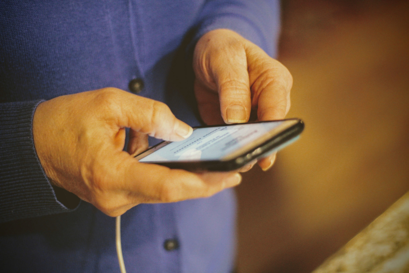
It’s very easy to lay your website out as you’d see it on a big screen and think it looks fine, but most people will view your site on a mobile device, either a tablet or a phone. Our recent figures show that 51% of Sawday’s users are on mobile, 6% on tablet devices like iPads and 43% on desktop computers, with the latter number dropping all the time. Responsive design (which allows your site to adjust to the user’s device) is an industry standard now, but some platforms handle it better than others. Information which you see as being at the top of a widescreen web page might be buried when the items on the page “stack” for view on a mobile device. You should always think “mobile first” when adding anything to your site and make sure you view it on a phone to check how it looks.
Clear navigation
Make sure menus, buttons and links are clearly labelled and easy to find. The button should tell people what to expect if they click on it, so while labels like “Come on in!” might be fun, a guest is looking for clear signposts like “gallery” or “check availability”. This is especially important when it comes to the things you want people to do. CTAs (technically CsTA, Calls to Action) are the buttons that move people through your site. They should be clearly visible and well labelled, not hyperlinked text. The calendar and booking mechanism are the two biggest examples of this. Your calendar should be accessible in a single click from your homepage and if people can’t book online, it should be extremely clear how they proceed to booking with you.
Contact details
Again, these should be nice and prominent, or clearly signposted. Guests are likely to visit your site multiple times when making a booking, and they will be comparing your place with others, probably using multiple browser tabs. Anything you can do to make contacting you with any questions as easy as possible, you should do, but the most important thing is to point guests to a phone number or email that you will regularly check or receive alerts from. A guest trying to book while at work may email or text rather than phone, but they will still need an answer as soon as possible.
Calendar
Calendar design is a headache of half squares, highlighting and colour choices. Our website calendar has been through several iterations and they certainly won’t be the last. A good calendar tells guests at a glance which dates are available and which are not. A great one also tells them which dates are available as check in days. This can be achieved in a variety of ways, but clarity and scannability is the key. Any information on booking rules and pricing rules and pricing should be communicated as clearly and concisely as possible, somewhere near the calendar so that guests have it to hand when looking for their dates. If you have any extra costs or booking fees, don’t conceal them until the point of booking. It might be tempting, but this only increases confusion from guests at the price they end up paying and can lead them to give up on booking with you.
Policies
Guests expect to find your booking terms and policies easily at several stages of their booking journey. They should be clearly linked from your footer and on your booking page or near your calendar. Cancellation and booking terms should be jargon-free and easy for anyone to understand. You can lay out all the strict legal terms in a full document elsewhere on site, but guests need to know the basics instantly.
Imagery
Imagery is possibly the single most important thing on your site. It’s important to strike a balance between the emotive and the informative, using shots that show each room, but also some that give guests an idea of the lifestyle of the place – views from the windows, any food etc. As important as composition of the photos themselves, however, is the uploading of them. Use web version of your images to keep the file sizes down. Do not upload professional standard photos directly to your website, because they will frustrate guests by making your site load very slowly. Site speed is important, especially to people browsing on mobile connections, and large images is one of the primary causes of site slowdown. Check your site speed here to see how you’re doing.
Colour and text styling
Accessible design, which takes into account the needs of all users, is something we strongly encourage and consider in our own on-site work. To make your site readable by as many people as possible, colours should have enough contrast between the label and the background that anyone can read text. Some people have visual disabilities which may mean they are unable to view text clearly with low contrast, meaning they miss your important information and can’t navigate your site. You can check your colour contrast here to see how your site rates at the moment.
Try not to cram your site with text and keep typefaces big and bold. For body text, size 14px or above is best for legibility. Anything smaller some users can find very difficult to read, especially, once again, on a small phone screen.
Use a contrasting colour to highlight your main call to action on a page, for instance a Book Now button. Try not to get carried away though! Only do this once per page otherwise users don’t know where to focus. Keep a consistent colour scheme for all other buttons and links so that the most important one stands out.
Text choice
Keep the most prominent text to what guests need to know. They will, as we’ve said elsewhere, be comparing your site with several others, so the key details should be accessible and scannable. Things like the story of your place and introducing yourselves are absolutely great, but they should be signposted from the homepage, rather than the first thing guests see. Get them wanting to stay with clear information and great images, then they’ll dig into the rest and you’ll have the chance to charm them with what’s on offer in the local area, the history of your ancient home or the freshly-laid eggs at breakfast.
Reviews
Reassure your visitors by adding social proof and guest testimonies to your website. This can be anything such as guest reviews, guest photos, testimonials or the Sawday’s badge of approval. Some website builders such as Wix or Squarespace have facilities that allow you to add a feed from your Instagram to your website and you can then use this to have guest posts appear on your site directly. Bear in mind that you may well need to monitor and moderate this though.
